theonlyD800inthehameau
Photography by theonlydeadheadinthehameau
Guiding the viewer
The latest task in Cee’s Compose Yourself Photo Challenge is to guide the viewer: in other words, to compose your image so that the viewer focuses on what you want them to see within it, rather than be distracted or have their attention drawn away from what they ‘ought’ to be looking at.
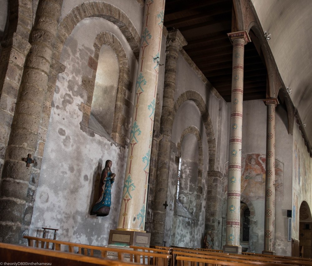
Bright Spot

The intended subject of this image, of a church interior in Rochechouart, is the decoration on the columns and walls on the left, but the eye can’t help but be drawn to the bright spot of the stained glass window on the right: so it has to go, leaving the focus of the image as it was intended:
The S Curve
A curved object in an image is almost always more interesting and attention-drawing than a straight line and, as Cee points out, it’s a common and perfectly respectable technique in pictures involving roads. Here are two images (the one on the right is a cropped version of the first) of light trails at the T-junction. Apart from eliminating the distractions of the vehicles stopped at the lights on the bottom left, the tighter crop’s curve also takes precedence in the eye over the otherwise intrusive angular traffic-light gantries.


Flipping The Horizon
Sometimes you take a photograph and it’s fine – except that you wish it could be the other way round – a mirror image. Of course, through the miracle of editing software it’s now very simple to get the image you want simply by flipping it. The two images below (taken just along the road on a sunny autumn day last year) are identical in every respect except that one is the mirror image of the other. Can you guess which was the original and – more to the point – which one do you prefer?


(Sometimes an image can also benefit from being flipped upside down, as I did recently in my contribution to the June One Photo Focus.)

Your One Photo Focus was clever flipping the vertical. These are great examples for this month. Wonderful entry. I’m not going to guess which of your flipped photos was the original. 😀 😀
No, I really can’t guess, been trying to 🙂 I think I prefer the one on the left because I’m used to reading from left to right and it seems more pleasing to the eye – or maybe soothing – that the framing is on the left (in the upper corner, the shadow…) and the empty space is on the right. Quite an analysis, right?!
It’s actually the one on the right – and I prefer it because, like you, I naturally look from left to right and I find that the tree stops the eye sliding away and makes it turn back into the body of the image. Of course there’s no right or wrong answer, but thanks so much for spending the time to think about it.
It was a fun post 🙂 And funny to hear you thought the opposite – for the same reason!!
Pingback: CCY Gold Star Award Winners: #22 Guide the Viewer an Flipping Photos | Cee's Photography