The Road To Brokedown Palace
Posted on April 22, 2016
This little turn-off from the rue that runs through the little hamlet we call Tranquility Base is probably my favourite stretch of road in the world. That’s our house – Brokedown Palace – at the end of it.
And that’s why.

Thursday Doors: Emily’s Henhouse
Posted on April 21, 2016
Emily, our nearest neighbour, keeps some chickens on a little plot just across the road from her house. They spend the day foraging around the patch of ground, but at night they’re shut up in this old building with doors that, it’s fair to say, have seen better days – although not for quite a while.

Thursday Doors 21 April 2016
Composition: The Outtakes
Posted on April 19, 2016
We’re having what the French call a pause pour reflexion in Cee’s Compose Yourself Photo Challenge this time around. A time to think about the ground we’ve covered already and also an opportunity to show some images that didn’t quite make the cut for posting under the various topics that we’ve dealt with in the past months. Here’s a selection of mine:
Perspective
Now, what is this a picture of? Is it the building on the right (the apartment block in Abu Dhabi where we lived for ten years)? Or is it the glass-plated building on the left? Or perhaps it’s the reflection of the former in the latter?

Diagonal Lines
I used an image of two giraffes in my first posting on the topic of diagonal lines, but I could equally have used this profile of a horse – one of many in the fields around here.

Now two images that cover more than one aspect of the various topics we’ve looked at so far:
Leading Lines & Analogous Colours
A hillside vineyard near the village of Ay, in the Champagne region shows blue and green together, as well as leading lines

Geometry and Contrasting Colours
Orange and blue dominate this image of a seal at Taronga Zoo in Sydney. Obviously the balanced ball is one geometric shape but the curve of the seal’s body is like an arc of a circle.

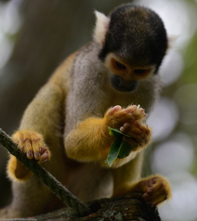
Weekly Photo Challenge: Dinnertime
Posted on April 16, 2016
In the Vallée des Singes nature park, a Capucin monkey eyes up one of his five a day:
Fences everywhere you look
Posted on April 15, 2016
This week, Cee’s Black & White Photo Challenge is on the subject of fences. Well, in this photograph taken at the La Sagne Hippodrome you have:
- In the foreground, the fence dividing spectators from the race course
- In the background, the fence marking the border of the racecourse
- In the middle, two steeplechase fences, with their accompanying siderails (also fences)
The horse that’s actually jumping the fence is a bonus:

Thursday Doors: Potting Shed
Posted on April 14, 2016
The back wall of our laverie (we use it as a utility room) is supported by a buttress. Our very clever builders used this to create a potting shed for Madame; they also made this nice little door for it.

Thursday Doors 14 April 2016
Hugh’s Weekly Photo Challenge: Week 21 – Fresh
Posted on April 13, 2016
It probably doesn’t get much fresher than this colourful display of salad leaves at the Rialto Market in Venice:

Weekly Photo Challenge: Future
Posted on April 9, 2016
When I saw that this week’s topic was ‘Future’, I knew exactly which image I wanted to use. Unfortunately, I didn’t take it (my son did) and nor do I have a copy in my library. However, the immensely talented Madame made a wall-hanging based on it, which now sits over our stairs. Here is my photograph of that:

It shows our twin grandsons taking their first unaccompanied walk together down the beach to the Arabian Gulf in Abu Dhabi. It always looked to me that they were heading off into the future.
I think I know why, too. When I was about their age now (eight), I remember a big – or so it seemed to me at the time – picture painted on the wall of the old Birkenhead Market. It showed a boy and a girl heading off down a path together towards a brightly shining sun: As I recall, it was actually an advert for childrens’ shoes and was captioned ‘The Highway To Health’. Anyway, the photo on the beach brought it back to me.
Tractor tyres
Posted on April 7, 2016
I see that the topic of ‘wheels’ has come around again (as it were) in this week’s Black & White challenge. The annual cavalcade of vintage agricultural vehicles at Lesterps guarantees plenty of interesting wheels.

Thursday Doors: Rochechouart
Posted on April 7, 2016
The town of Rochechouart is dominated by its medieval Chateau. It has a cloister, in one corner of which are these intriguing doors (and unusual ‘candy cane’ columns).

Thursday Doors 7 April 2016
Top Posts & Pages


