Faraway
Posted on December 20, 2015
Where we live is quite close to the geographical centre of mainland France (l’hexagone), so not surprisingly the skies above us are quite busy with planes flying to or from faraway places – sometimes to quite dramatic effect:

Fortunately, they are at high altitude when they pass over, so we can’t hear them
Weekly Photo Challenge: Gathering
Posted on December 20, 2015
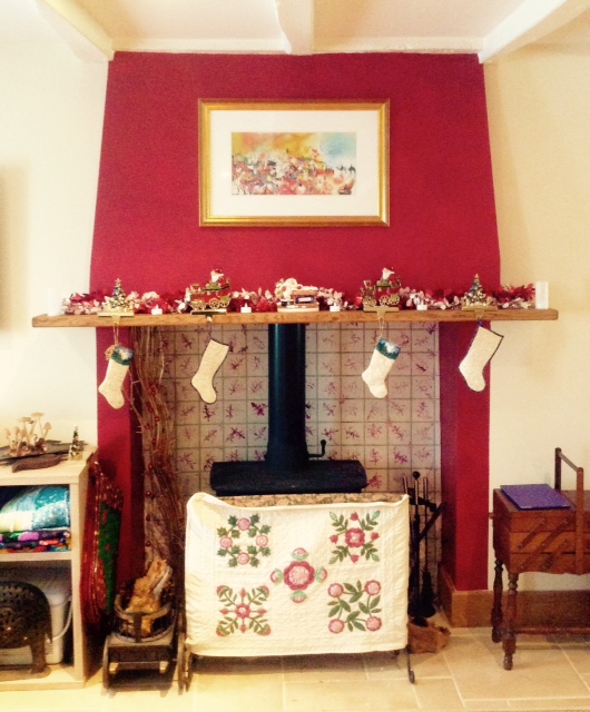
Daughter, son-in-law and grandsons are going to gather with us for Christmas, arriving on Tuesday. We think we’re ready for them…
Before & After: Boat
Posted on December 18, 2015
My little exercise in post-processing this week was actually inspired by the December One Photo Focus, which was published last Friday. My own humble effort can be found here, but I was particularly interested by some of the other participants’ use of the more sophisticated and creative tools available in Photoshop. Apart from anything else, it made me more determined than ever to try to get to grips properly with this extraordinarily sophisticated (downright clever) program.
Original image

This photograph was taken at the famous lily pond in Claude Monet’s garden at Giverny, in Normandy. The day was very overcast and drizzly, so the light was very flat, the water looks very drab and even the reflections are rather dull. The whole thing obviously needs some work.
Lightroom

Some basic editing in Lightroom helped to cheer up the image. Cropping made the boat the centre of attention and some work with the sliders brought out more detail. Increasing the Green Saturation helped to overcome the overall flatness, and moving up the Clarity and Vibrance gave the image more punch. Without being anything special, it’s a lot better than it was.
Photoshop
Then it occurred to me that, since the picture was taken in a painter’s garden, why not make it look more like a painting? And since Monet was, of course, an Impressionist, why not try to give it something of an impressionist feel?
So I used the Paint Daub effect in Photoshop and came up with the image below. I could have made the effect more extreme, but – if I’m honest – chickened out. Anyway, it’s far removed from the original image and, I think, a lot more interesting.

Thursday Doors: Close To Home
Posted on December 17, 2015
Last week’s door wasn’t very far from here, but today I’m even closer to home: about 30 feet from my back door.
Our house is actually two cottages knocked together (if you want to know a little more, you can read this) and forms one end of a larger bâtiment which includes two barns, one of which belongs to us and one to our neighbour, Albert (whose own house is just in front of ours). Needless to say, this being rural France, our barn is at the far end of the bâtiment, and it’s Albert’s that adjoins our house.
You get used to it.
Anyway, this picture is a detail of the very ancient side door to Albert’s barn. You can get some idea of its age from the grooves that have been worn in the wood from the swinging latch. I’m glad I took this when I did, because he’s only gone and painted it, hasn’t he?

Centred
Posted on December 16, 2015
This week we focus on images that, with a healthy disregard for the rule of thirds, are intended to be placed in the middle of the frame: to be literally the centre of attention.
This image was taken looking down a corridor in the cellars of a wine-producing chateau in the Bordeaux region:

Flowers are a very obvious ‘centre-friendly’ subject – particularly when photographing buds, before the petals start to compete for space in the frame:


Also, of course, anything circular has an obvious central focus, be it wheels or even fireworks:


And finally this is just one of my most favourite images: it was taken looking directly upwards to the ceiling of the reception area of the Sir Bani Yas Hotel in Abu Dhabi. Those lanterns are between six and eight feet high when you see them sideways on from the second floor.

Weekly Photo Challenge: Oops
Posted on December 12, 2015
This supermarket in Dubai probably ought to get a new advertising copywriter…

Before & After: Cradle
Posted on December 11, 2015
This photograph was taken in less than ideal conditions: in a local stately home during an Open Day, as I shuffled – along with many other people – past the open doorway of a nursery. With no time to frame a shot, or to do much more than simply record what was on view, it would obviously be necessary to make the best of whatever I was able to get at a later stage.
Original Image

Apart from the clutter, the key challenge was obviously to deal with the very strong backlight from the sun streaming through the uncurtained window.
Edited Version

The focal point is clearly the cradle, so the crop was pretty obvious. The lamp on the table gives a sense of scale and also balance and there wasn’t much that could be done about the window apart from cut out as much as possible.
The cradle is interesting in itself, not only for its antiquity but also the intricate metalwork and the delicate lace, the details of which are ‘blown out’ in the original by the sunlight. I offset this to the best of my ability by:
- Taking down both ‘Highlights’ and ‘Whites’ to -100 brought much of this back
- Boosting ‘Clarity’ to +55 brought back some more of the lost detail, while ramping up both ‘Vibrance’ and ‘Saturation’, gave a more solid feel to the bed-linen and the metalwork.
- I boosted both the Saturation and Luminance of the individual Yellow slider, which also helped to offset the ‘blinding’ effect of the sunlight.
Bricks and a bike in Bruges
Posted on December 11, 2015
Three for the price of one this week.
Cee’s latest Black & White challenge calls for something beginning with either B or W. Well, here is an image of a bicycle propped up against a brick wall in Bruges. Which, come to think of it, is in Belgium.

Oh, and what do bicycles have? Why, wheels of course. So make that four for the price of one.
Rule of Thirds (2)
Posted on December 10, 2015
To be honest, finding ‘ready-made’ images that occupy two-thirds of the picture was a bit of a challenge. That probably just goes to show that I am (or was) too wedded to sticking the subject in the middle of the photograph as a matter of course. Still, a bit of creative cropping did the job.
This week, I have three pairs of similar images illustrating the 2/3rds theme (hover over the image and caption for a fuller description).
To begin with, a couple of archways:


And here are two water-based scenes:


And finally (appropriately) two sunsets:


Cee’s Compose Yourself Challenge: Using 2/3rds of your photo frame
Thursday Doors: Bernard’s Barn
Posted on December 10, 2015
This is the door of the barn that belongs to my neighbour Bernard; it’s about 100 feet from my own front door.
Earlier this year, Bernard replaced the roof of this barn, which was in a very poor condition. As a result we were, for a couple of weeks, inundated by displaced barn spiders about the size of your fist.
Be that as it may, he left the door in its original state. I quite like the sapling growing in front of it, which adds some contrast.

Top Posts & Pages


